Units in css
Units in css(em,rem,pt,px,vw,vh,vmin,vmax,ex,ch…)
本文将从相对单位、绝对单位以及viewpoint units三个类型来介绍在css中的单位。
相对单位
与绝对单位(如:px)不同,我们也可以用相对单位来定义尺寸。在大多数浏览器中,默认的字体大小是16px,可以把这个尺寸作为基值来计算。比如16px=1em,1rem或者100%。
| 单位 | 描述 |
|---|---|
| em | 基准点为父节点字体的大小,如果自身定义了font-size按自身来计算,整个页面内1em不是一个固定的值。 |
| rem | 可理解为”root em”, 相对根节点html的字体大小来计算 |
| % | 百分比 |
| ch | 相对于“0”的宽度 |
| ex | ex单位定义为“当前字体x的高度或1em的二分之一”。 给定字体x的高度是该字体的小写x的高度。通常,大约是字体的中间标记。 |

The units ex and ch, similar to em and rem, rely on the current font and font size. However, unlike em and rem, these units also rely on the font-family, as they are determined based on font-specific measures.The ch unit is defined as being the “advanced measure” of the width of the zero character, 0. The basic concept is that, given a monospace font, a box with a width of N character units, such as width: 40ch;, can always contain a string with 40 characters in that particular font. While conventional uses of this particular rule relate to laying out braille(盲文), the possibilities for creativity here certainly extend beyond these simple applications.The ex unit is defined as the “x-height of the current font OR one-half of one em”. Thex-height of a given font is the height of the lower-case x of that font. Often times, this is about at the middle mark of the font.
绝对单位
| 单位 | 描述 |
|---|---|
| cm | centimeters, 1cm = 1cm |
| mm | millimeters, 10mm = 1cm |
| in | inches, 1in = 96px = 2.54cm |
| px | pixels, 1px = 1/96 in |
| pt | points, 1pt = 1/72 in |
| pc | pica, 1pc = 12pt = 1/6 in |
viewpoint units
viewpoint units代表当前浏览器视口的百分比。与百分比单位的区别在于,viewpoint units始终以浏览器视口大小的百分比计算。百分比单位继承其父元素的大小。
| 单位 | 描述 |
|---|---|
| vw | 视窗宽度,1vw等于视窗宽度的1% |
| vh | 视窗高度,1vh等于视窗高度的1% |
| vmax | 1% of viewport’s smaller (vw or vh) dimension |
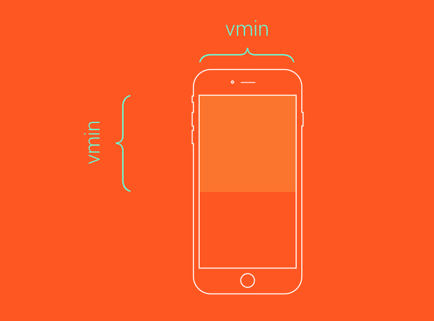
| vmin | 1% of viewport’s smaller (vw or vh) dimension |


.jpg)